Websites
Search
Activity
Learn
Support Us
Sign up for Free
Sign In
Neocities.org
Local Buzzcuts
jacedorian.neocities.org
38,546
views
14
followers
3,334
updates
0
tips
Share
Send a Tip
jacedorian
updated their site.
1 year ago
home
jacedorian
updated their site.
1 year ago
home
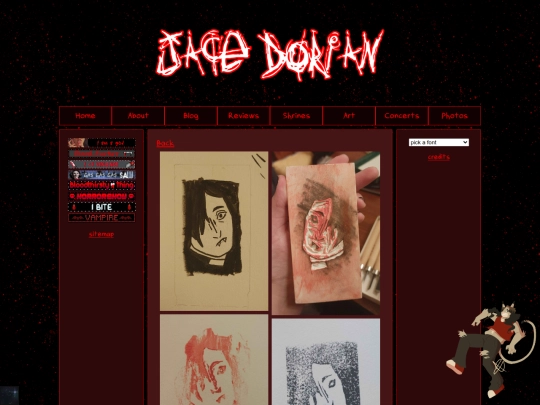
art
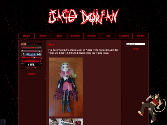
art/may-2025
jacedorian
updated their site.
1 year ago
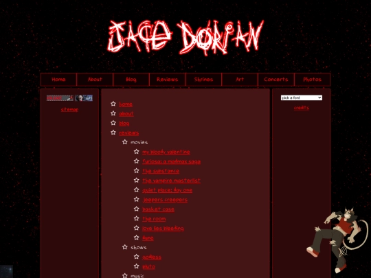
reviews
reviews/books/muse
home
jacedorian
updated their site.
1 year ago
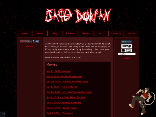
reviews/movies/vampires
reviews/movies/theroom
reviews/movies/substance
reviews/movies/quietplace
reviews/movies/mybloodyvalentine
reviews/movies/loveliesbleeding
reviews/movies/jeeperscreepers
reviews/movies/furiosa
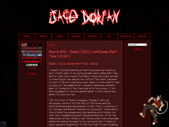
reviews/movies/dune
reviews/movies/basketcase
jacedorian
updated their site.
1 year ago
index
jacedorian
updated their site.
1 year ago
credits
index
jacedorian
updated their site.
1 year ago
jacedorian
updated their site.
1 year ago
index
sitemap
reviews
reviews/movies/mybloodyvalentine
jacedorian
updated their site.
1 year ago
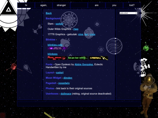
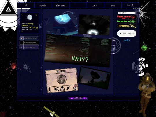
space/credits
credits
blog
reviews/movies/jeeperscreepers
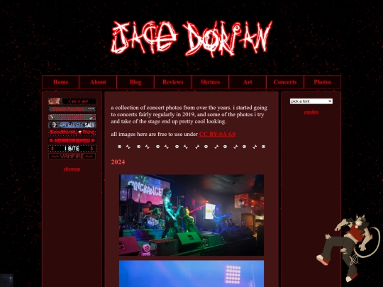
concertphotos
art/mar-2022
art/jan-2023
art/dec-2024
art/aug-2022
art/sep-2024
jacedorian
updated their site.
1 year ago
space/credits
space
1
2
3
4
5
6
7
8
9
10
11
Website Stats
Last updated
3 weeks ago
Created
Feb 26, 2024
Site Traffic Stats
This site follows
Followers
Tags
reviews
music
art
personal
blog