Confounding Tales
confounding-tales-magazine.neocities.org
10,380 views
9 followers
268 updates
0 tips
last updated 3 years ago. HELLOOOOOOOOOOOOOOOOOOOO INTO THE VOIDDDDDDDDDDDDDDDDDDDDDDD!
1 like
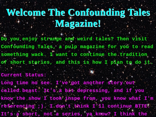
The starry background isn't impeding to reading as I thought it'd be, somehow. Love the tales ( and my featuring on the second paragraph of BttE 1 :] ). Keep going, I love it so far!
 confounding-tales-magazine
5 years ago
Thanks! Incorporating the starry background and making the text readable took a while, but it all worked out in the end.
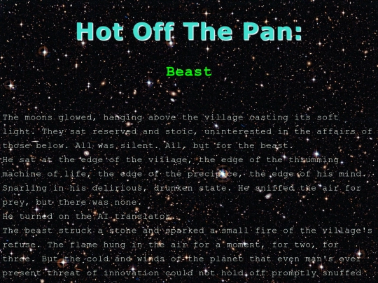
i would suggest using a different font for the text... it's really hard to read as it's one of those "display fonts", meant for titles and stuff, not body text.
 debris
5 years ago
Thank you for the feedback! I switched over to topsicle. I think I should use elecstrom (the previous font) ,along with a text shadow that makes the font look lighter, for titles. I'm not planning on having a pure console aesthetic, I thought it was a good intro.


Thanks! I'll try to keep it :]