
Your website looks nice! I like the color scheme, and the navigation terminal is so cool!
1 like
Is a responsive website design (without using things like vh and vw) solely dependent on aspect ratio? I like a weird meaningless feature I gave my front page when I make the window as small as possible and can be revealed or hid vertically, but said feature leads to my page being a little less responsive if I were to view it on a mobile device as making the measurements responsive would prevent the pointless thing.
1 like
 tabf5
2 months ago
tabf5
2 months ago
No it can also be dependent on how wide the screen resolution is. I forget how or why it works but even a modern phone with a super crisp screen tells CSS that it's only like 480px wide or something. I think it has to do with some scaling factor changing on phones that's left alone at 1.0 on desktops. I use both this and aspect ratio and it's kind of a mess but it works. See at bottom here: https://tabf5.com/all.css
1 like
 dabu18
2 months ago
dabu18
2 months ago
Oo okay I see, also if I'm reading it correctly, does "@media only screen" mean it only changes the elements if the screen size itself and not the window is specifically in those ranges?

site update is imminent. Btw I might as well say this now, I got your stickers some time ago and they look so cool! The envelope is so cool too so I'm keeping it as well :D
1 like
1 like
dabu18
3 months ago
Oh? Sorry I meant for my website lol, you're my only follower so I thought I'd just tell you directly '<'
1 like
1 like
1 like


1 like
1 like
1 like


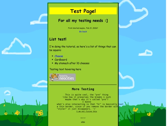
Just tried to understand a few js things. Nothing new is actually tested on the page though, it's just a bunch of words.