
"[…] comfortable for my eyes" : same! I want to make multiple themes, but they’re all going to be dyslexia friendly or have some sort of option to make the so
1 like
I do appreciate the choice of open dyslexic as the site's go-to font
1 like
 annatells
2 years ago
annatells
2 years ago
Thank you! I'm glad you appreciate it. I've been trying to make a site that's relatively comfortable for my eyes
1 like
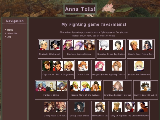
slapping on a list of all of my fighting game mains for no particular reason, a good way to spend the day
1 like

I also like that the light text isn’t too high contrast on the dark background—I can’t read high contrast light text on a dark background, so I have _a lot_ of trouble with most dark themes. Idk if it’s a dyslexic thing or not.
Yeah! My thoughts for the layout design was A) use my fav color, a desaturated lavender, somewhere, and also make sure the overall theme is dark but comfortably readable and B) use WCAG guidelines as a jumping-off point for my layout and design
From our experience it can vary from person to person. We tend to find dark themes more comfortable and it is more dense bodies of text that cause more serious problems. We hope our text does not cause too much of an issue for you Passenger Coborski