something kind of cool i just notice is that "click" noise.
[selfidea] Index picks random index HTML. Index is always different. Console(implemented)/PS2/Loadingbar/filebrowser/cypunk gui.
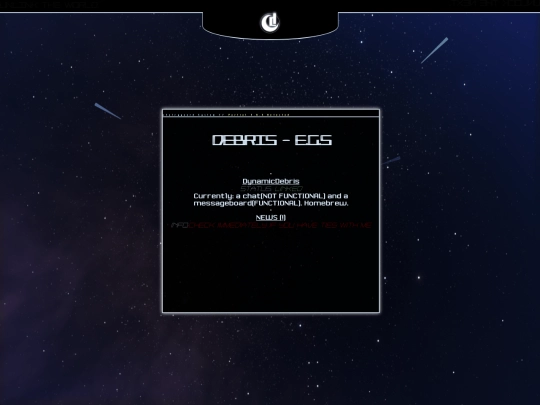
Smooth and smart. I like the text shadow (I'm assuming that's what it is) - blur hack, but perhaps you should let it be temporary (ex: used when page not finished loading) then transform to a sharper text shadow,as the blur feels like the page isn't done processing. Love it otherwise :]
1 like
The starry background isn't impeding to reading as I thought it'd be, somehow. Love the tales ( and my featuring on the second paragraph of BttE 1 :] ). Keep going, I love it so far!
 confounding-tales-magazine
4 years ago
Thanks! Incorporating the starry background and making the text readable took a while, but it all worked out in the end.
i would suggest using a different font for the text... it's really hard to read as it's one of those "display fonts", meant for titles and stuff, not body text.
 debris
4 years ago
Thank you for the feedback! I switched over to topsicle. I think I should use elecstrom (the previous font) ,along with a text shadow that makes the font look lighter, for titles. I'm not planning on having a pure console aesthetic, I thought it was a good intro.







Thanks! I'll try to keep it :]