I flunked my way through college with improper use of line spacing... that and margins and font sizes... I never had enough to write.
Same, I was always getting "need to expand more on this" notes on my papers.
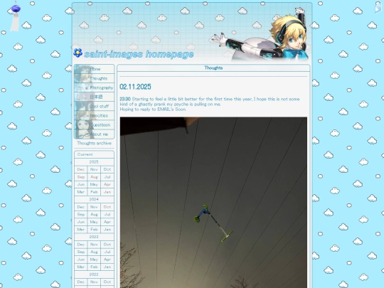
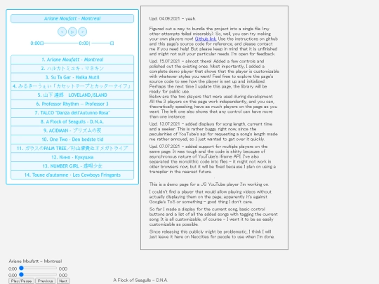
Thanks! I made those in Gimp. The images have been put through the Colors -> Dither tool and the text tool was set to "no antialiasing". The look was inspired with sample images from an old version of MS FrontPage. As for the gradient under the text, I wish I remembered because I can't recreate it right now (I have the template file saved though)... \( ̄︶ ̄*\)) Perhaps dithering was involved too.
Oh, okay. I'm glad you liked my image, I usually just steal them from somewhere and try to keep the filesize down. I use paint.NET but I like the dithered look of yours a lot.
@rbuchanan does the page look broken to you? Here I'm using white-space: pre; which should work the same way as .
As the pre tag. Interestingly enough, apparently Neocities sanitizes comments by removing any tags from them. Test: , , ,
On Qutebrowser and Chrome, it works; on every other browser I use (Otter, Firefox, Opera, Dillo, all textual browsers), it renders as a collapsed, non-proportional mess. Assignment of a class to a pre element in your CSS would be a more easy, flexible, efficient and broadly compatible alternative.
Hmm, it works for me in FF as well. Thank you for reporting! I will look into it.
also, I think your "this is miserable" part is a over reacting a bit, most of portugal looks like that and most people including me dont want to jump off a building after going outside
A proper explanation would span multiple comments. I'll write an elaborated post about it very soon for those interested!
Thank you <3
I wasn't wrong. So many interesting things there... The Y2K aesthetics page is top notch. I'm delighted to find another web developer who's also interested in linguistics. <(^-^)>
Yay, linguistics!!! Also, your photos are lovely